Sometimes you just don’t get perfect foiling. It happens because foiling is a bit finnicky — you need the right sandwich, the right heat, the right paper and it just doesn’t always come together. But even when I don’t get a perfect foil — you can still use it!
This is a very simple but elegant stencil that can be the focal point of any card but I couldn’t help step it up. I split the paper in quarters and then rotated the design around the center point. Of course, it was perfect for a rainbow array of colors.
All my supplies for creating this card will be listed down below (with multiple sources when available) for your curiosity and convenience. Affiliate links used when possible
Ever use the positive piece of a die cut positive to get the mirrored version of it? I did it here for a simple reflection. It’s such an easy trick for a cool look!
All my supplies for creating this card will be listed down below (with multiple sources when available) for your curiosity and convenience. Affiliate links used when possible.
I have such a hard time with masculine cards — usually the trick is to keep it simple with no frills but I couldn’t help but add a little gold splatter…
All my supplies for creating this card will be listed down below (with multiple sources when available) for your curiosity and convenience. Affiliate links used when possible.
Let’s create a pattern just by using masking tape and some ink blending. I thought it would be so fun to create with this jumbo jumbo die cut. AND it lets me create 2 cards at the same time. Perfect!
All my supplies for creating this card will be listed down below (with multiple sources when available) for your curiosity and convenience. Affiliate links used when possible.
I love when a die cover plate creates an entire scene. I used this Mountain Scene Cover Plate cut out of watercolor paper. Then I did some easy painting and then put this back together like a little puzzle.
All my supplies for creating this card will be listed down below (with multiple sources when available) for your curiosity and convenience. Affiliate links used when possible.
Have you used neon watercolors? I’m a big fan because they are so fun and bright!
All my supplies for creating this card will be listed down below (with multiple sources when available) for your curiosity and convenience. Affiliate links used when possible
Ever mix Hot Foils and ink blending? I don’t know why I haven’t done it sooner to add that pop of color when using a neutral hot foil color. It turned out so pretty and I got the rainbow colors in!
Hi! So not all my watercolor panels turn out cute at all and I end up hoarding them because I don’t know what to do with them BUT … these Jumbo Rose die cuts really help me out because it works so well for die cuts!
All my supplies for creating this card will be listed down below (with multiple sources when available) for your curiosity and convenience. Affiliate links used when possible.
All my supplies for creating this card will be listed down below (with multiple sources when available) for your curiosity and convenience. Affiliate links used when possible.
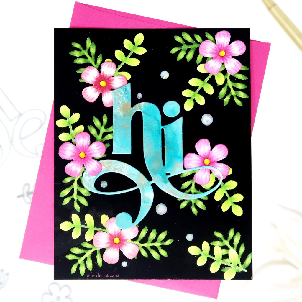
Happy Friday-eve! Today, I’m sharing a card featuring a bunch of Erin Lee Creative products, which ended up with an unintentional tropical card.
All my supplies for creating this card will be listed down below (with multiple sources when available) for your curiosity and convenience. Affiliate links used when possible.
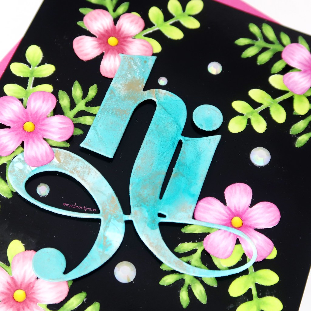
I went into this card because I had just learned that you could use alcohol inks on Erin Lee Creative’s Glossy White cardstock so I just wanted to play around to see how it would turn out. I wanted to keep it pretty simple so I just used Pool alcohol ink with some Gold Mixative along with the Blender for a very simple alcohol mix. It does move a little differently compared to Yupo paper but it works really well. I used that panel to cut out the main sentiment using the Jumbo Hi die. It’s generally pretty subtle but I thought it was really pretty, adding something special to the sentiment since there’s a good amount of space for the texture on this sentiment.
For the rest of the card, I used three of the dies from the Birdhouse Builder die set. Using copic markers, I added color onto it because I wanted the texture on them. Of course, you could just easily cut them out using different colored cardstock but I had my markers out so I figured why not. I placed the sentiments and the die cuts on a piece of A2 Glossy Black cardstock. Oh my! This is so fun to play with because it’s so dark and made my sentiment and florals REALLY pop.
To finish off this card, I used a few embellishments from Trinity Stamps (which are no longer in the shop, but you can use any ones you have in your stash) to fill up the empty space and I love the final product.
Thanks for stopping by! Happy Crafting!
→ SUPPLIES USED ←
Some products are provided by manufacturers for review and use. Affiliate links may be used at no cost to you.
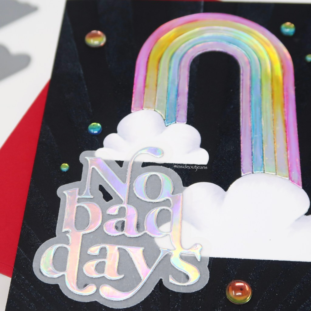
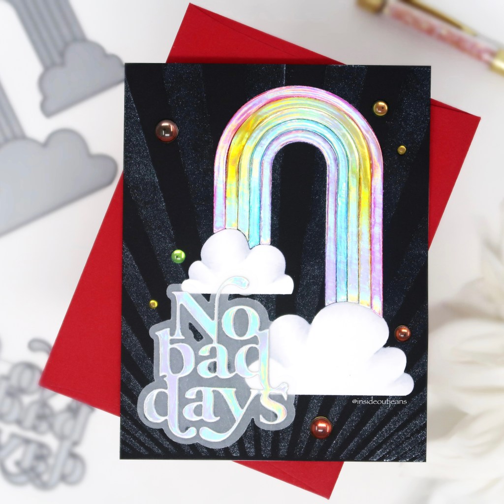
Happy Friday everyone! TGIF! I am so excited to share this card with you today — I think it’s one of my favorite cards I’ve made in a really long time. It features some items from the newest kit from Erin Lee Creative and this one is a stunner!
All my supplies for creating this card will be listed down below (with multiple sources when available) for your curiosity and convenience. Affiliate links used when possible.
I had an idea that involved playing with the ever so popular holographic cardstock sold in her store and changing the color of it by using some inks. First, I die cut the rainbow using one of the dies that comes in the Shine Bright kit with holographic cardstock. Then, I used a rainbow array of colors from Ink on 3: Marilyn Red, Marigold Orange, Goddess Green, Peacock Blue and My Jam Purple. I pounced on the color for each rainbow stripe using a blending tool. To trap the color, I added Glossy Accents on top of each stripe separately and let them dry. Not only does it trap the color, it adds dimension to each of the rainbow stripes.
I went ahead and used that same Rainbow die to cut out the clouds out of white cardstock. I used some copic markers to add a bit of dimension to them.Also, in the kit, it has a standalone die and shadow for the No Bad Days sentiment. I cut out the words from holographic cardstock and the shadow from vellum.
For my background panel, I used one of the sun ray stencils in the kit. There’s two that can be used to layer on top of each other so you’d have two different rays of colors. For my card, I decided only to use one with Ink on 3’s Liquid Pixie dust on black cardstock. Since it’s on dark cardstock, you won’t see it until it hits the light and adds that extra bling to any card.
I absolutely love this card and the kit that I used to create it. It’s so fun and I think it’s totally worth it! I’ll be sharing additional ideas in the coming weeks using this kit as well. I’m also participating in the Shine Bright instagram hop so if you want to see more wonderful ideas, please stop by here.
Thanks for stopping by! Happy Crafting!
→ SUPPLIES USED ←
Some products are provided by manufacturers for review and use. Affiliate links may be used at no cost to you.