Black ink is pretty harsh especially on white, but when you stamp on pattern paper, it ends up being a pretty subtle look. I went with really simple for this card — stamping, and adding a sentiment.
All my supplies for creating this card will be listed down below (with multiple sources when available) for your curiosity and convenience. Affiliate links used when possible.
Smaller images are harder to create a scene since you need to use more to fill up the space BUT if you use a large die cut sentiment, you can place the images within and fill up the space that way.
All my supplies for creating this card will be listed down below (with multiple sources when available) for your curiosity and convenience. Affiliate links used when possible.
Looking for an easy card? Got a lot of pattern paper? This is an easy idea to incorporate both!
All my supplies for creating this card will be listed down below (with multiple sources when available) for your curiosity and convenience. Affiliate links used when possible.
Let’s start by taking a closer look at the December Card Kit of the Month.
Includes:
Clear Stamp Set, 6” x 8”
15 Coordinating Dies
Floral Circle Fancy Die
5 Reactive Inkers, 1/2 oz. (Purple Galaxy, Blue Hawaii, Green Apple, Lemon Drop, Fruit Punch)
Plastic Watercolor Palette
There’s a ton of inspiration and the full blog lineup can be found on the Hero Arts blog. You should be coming from Ilina Crouse‘s blog and your next stop will be Jennifer Kotas. The full blog list will also be updated below!
I have two cards to share with you today featuring this month’s kit and one of the Extraordinary Extras.
The first card focuses on the Card Kit of the Month. This Card Kit contains a ton of fun pieces that you can make a colorful card. I did a very simple card using the reinkers with water to create a light watercolor background. Then I stamped the images and sentiments for a very simple card.
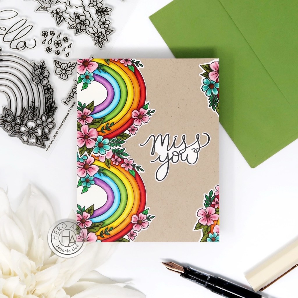
My second project focuses on the stamp set from the Extraordinary Extras, Floral Rainbow & Clouds. I stamepd and colored the rainbow and used it as a border to use it outside of its ordinary use. I used the coordinating dies to cut out the images and sentiments and placed it on top of cardstock.
Thanks for stopping by today and I hope you enjoyed the two cards I shared today using some of the new Hero Studio collection. Hope you were inspired to create!
Giveaway:
Hero Arts will give away a $50 gift card, drawn from the comments left across the hop. Enter by Sunday, December 8 at 11:59pm PST, and the winner will be announced on the Hero Arts blog the following week.
Scene cards are made easier when you can use ink blending to quickly color up the background to create the scene you need. Here I used brown for the sand and then blue for the ocean… of course, I had to pick some pretty colors for a sunset sky as well.
All my supplies for creating this card will be listed down below (with multiple sources when available) for your curiosity and convenience. Affiliate links used when possible.
When I first started making cards, I picked colors with no rhyme or reason… and although that is absolutely fine, sometimes, it just needed look cohesive. The trick is to incorporate the same color palette throughout!
All my supplies for creating this card will be listed down below (with multiple sources when available) for your curiosity and convenience. Affiliate links used when possible.
I love all the detailed images from a red rubber stamp but sometimes it’s a little too much to color! It’s easy to stamp a bunch on them to create an easy background paired with a simple sentiment.
All my supplies for creating this card will be listed down below (with multiple sources when available) for your curiosity and convenience. Affiliate links used when possible.
I’m used to blending brushes or a ink blending tool, but these pint sized pouncers are great for stenciling but also for creating skies! I love the effect of these pouncers for mimicking clouds!
All my supplies for creating this card will be listed down below (with multiple sources when available) for your curiosity and convenience. Affiliate links used when possible.
Sometimes I play with white space and here is an example of that. I focus my ink blending on the left hand side of my card panel. This was particularly a perfect match with one of the newest Trinity releases stamp sets where the images are stacked on top of each other in one image.
All my supplies for creating this card will be listed down below (with multiple sources when available) for your curiosity and convenience. Affiliate links used when possible.
Florals are so fun to color and you can literally use whatever colors you want… but sometimes, I just wanna use a rainbow array of it! It’s my go to when I don’t have any idea what to use. Oh, and have I mentioned how much I love the postage stamp trend happening in the card making community? Love!
All my supplies for creating this card will be listed down below (with multiple sources when available) for your curiosity and convenience. Affiliate links used when possible.
I cannot resist creating fall scene cards AND Penelope’s outfit is so cute! Gotta love all the pumpkins as well.
All my supplies for creating this card will be listed down below (with multiple sources when available) for your curiosity and convenience. Affiliate links used when possible.
I love fall and this background is so subtle and pretty with ombre leaves — I also created a border of sunflowers down the card panel. I just can’t help but use copic markers to color up my die cut images.
All my supplies for creating this card will be listed down below (with multiple sources when available) for your curiosity and convenience. Affiliate links used when possible.