Happy Thursday! Today is Day 2 of blog hops showcasing Pretty Pink Posh’s new release. Check out everyone’s projects for inspiration and leave a comment. There will be a $25 up for grabs. The winners will be picked randomly along the blog hop. There’s a total of three $30 gift cards, one for each day so be sure to stop by Pretty Pink Posh’s blog tomorrow and the day after! Comments must be left by 11:59 PM PST on 8/17/2022. Winners will be announced on the Pretty Pink Posh blog.
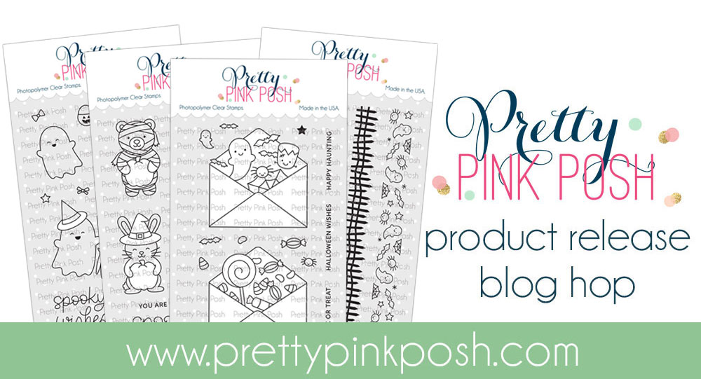
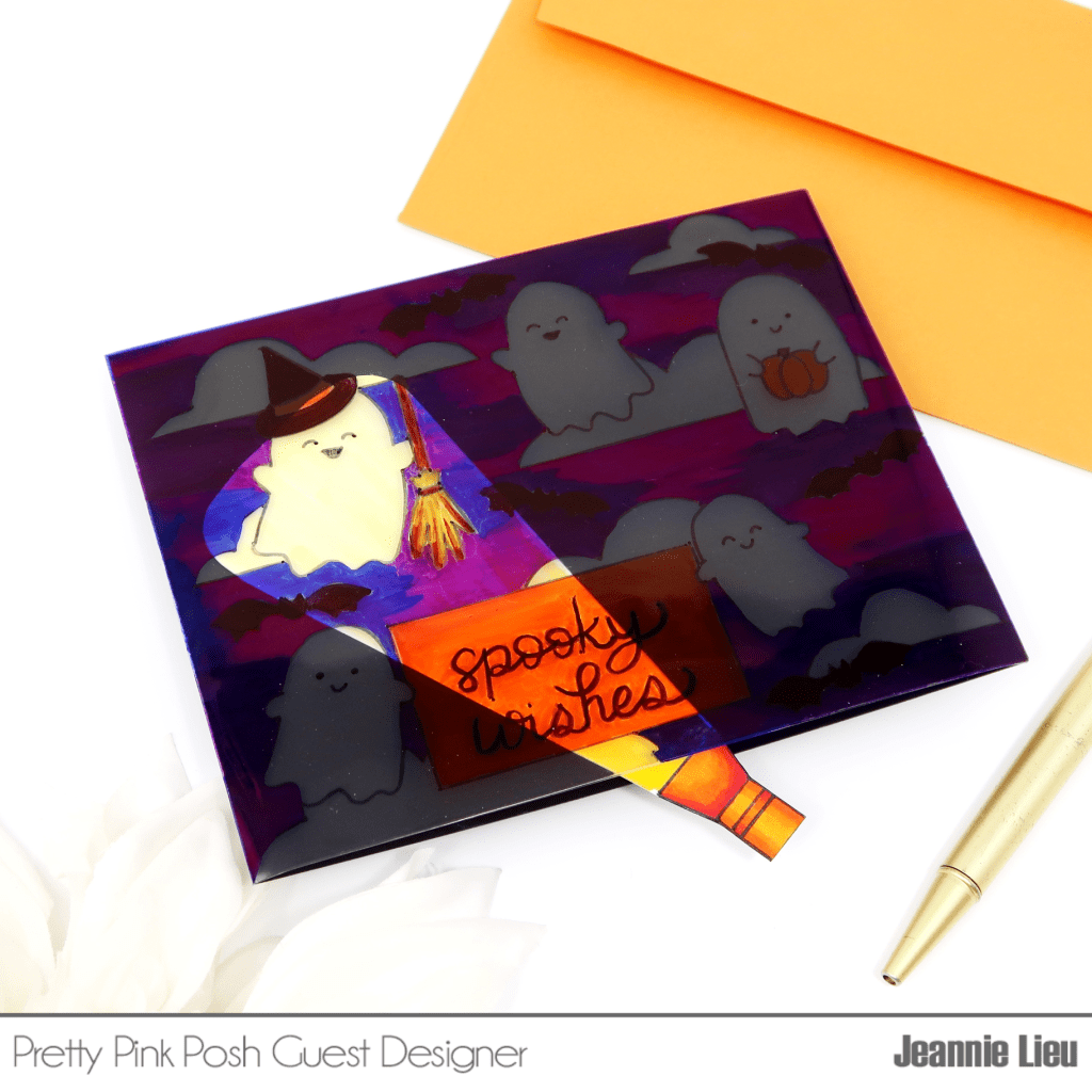
I’m super excited to share my card for today showcasing a couple of the new release items from Pretty Pink Posh. I’ve never been a huge fan of Halloween cards but last year, I really got into them and now, I’m loving when it rolls around. This new release from Pretty Pink Posh has me super excited and once I saw the Ghost Friends, I had to bring back the flashlight card. I’ve done it previously here but I wanted to show a second way of creating it — it’s easy and super fun for the kiddies (even if you’re not a cardmaker)!

To start off, I stamped out a little scene using Ghost Friends and I wanted to use all of them, including a sentiment. Then I used the Spooky Sky stencil from last year’s Halloween release — you can use this or anything else you want — and used it as a literal stencil with a pencil. Once I had my scene ready to go, I pulled out an A2 shaker pocket and slipped my card panel inside but don’t close it up!

Using an ultra fine point sharpie, I went ahead and traced all my images. Alternatively, you could stamp out the images using Stazon because it’ll work on acetate. Then once all my images are traced, I’m going to go ahead and color it. It’s helpful to add a white panel under the acetate so you can see your coloring. For coloring on acetate, I’m using Sharpies — specifically the ones with the brush tip because it’s easier and quicker to color. You can also use any alcohol markers as well (these leave a bit of residue so I would suggest using an anti-static powder on top to remove the stickiness). Once I finished coloring, I’ll remove the white panel and insert a black panel, flip it over, and remove the release paper so it can adhere to the black cardstock. Then I freehand a flashlight and coloring it up with copic markers and the ray of light will be colored in yellow to give it a realistic look. Once I’m done, I’ll go ahead and fussy cut it out. Then let’s go ghost hunting!!!
If you want to see the entire project from start to finish, I’ll leave my YouTube video below.
I really loved how my card turned out and hope it inspires you! Again, make sure to hop along the fellow designers for more inspiration and for a chance to win a $25 giftcard.
BLOG HOP LINEUP
Pretty Pink Posh blog
Amy Rysavy
Mindy Eggen
Rebecca Keppel
Lindsey Larsen
Wanda Guess
Kristie Marcotte
Jeannie Lieu **YOU ARE HERE**
>> SUPPLIES USED <<
Pretty Pink Posh – Ghost Friends
—PPP: https://shrsl.com/3nayf
—SSS:
—EH:
Pretty Pink Posh – Spooky Sky Stencils
—PPP: https://shrsl.com/3nayv
—SSS: https://shrsl.com/3naz1
—EH: https://bit.ly/3P5903v
Tonic A2 Shaker Pocket
—SSS: https://shrsl.com/3jk69
—EH: https://bit.ly/38xBO5j
Tonic 5×7 Shaker Pocket
—Amzn: https://amzn.to/3QgweEO
—Scom: https://shrsl.com/3naym
—SSS: https://shrsl.com/3nayn
Waffle Flower – A2 Shaker Cover
—Amzn: https://amzn.to/3vKcWzS
—Scom: https://shrsl.com/3nayl
—SSS: https://shrsl.com/3nayo
—EH: https://bit.ly/3vKnIpw
Sharpie Brush Tip Permanent Markers
—Amzn: https://amzn.to/3ddPNzl
Sharpie – Permanent Marker – Ultra Fine Point
—Amzn: https://amzn.to/3Sv7Scm
Hero Arts – Pitch Black Cardstock
–HA: https://shrsl.com/3nb1q
–SSS: https://shrsl.com/3nb1t
–EH: https://bit.ly/3zZKQmG